3 months / 2021 / Team of UX Designer, Researcher, UI Designer

School administrators aren't software engineers
Actionaly is a family relationship platform for elementary schools. What started out as a group messaging app evolved into a single platform to send out notifications, submit paperwork, collect fees, and communicate with teachers across an entire school district.
The Admin Panel started an internal tool that was released to customers out of necessity during COVID. School administrators complained that setting up the app was confusing, and we saw opportunities to give them more autonomy. My contribution was part of a larger project that went through phases and testing together.
Make it pretty, but make it smart
With my team's support, I introduced (1) a personalized Home screen that eliminates hard-to-find features and (2) a refresh of the left rail navigation. The new dashboard home screen gives users a quick snapshot of family engagement at their school, which is particularly valuable for a principal or super intendant, and the new taxonomy makes navigation more clear.
Most people didn't know where to find anything
The client provided 8 current users of the admin panel to take us through their workflow and identify their most critical pain points.
Key learnings
There’s a lot of data available, but it’s not actionable
The 1:1 onboarding experience was thorough but theoretical, the app needed more prompting
Jargon is unclear and makes users feel a lack of confidence
The Home screen is barren and should orient the user in the app
Could you explain what that is?
Navigation
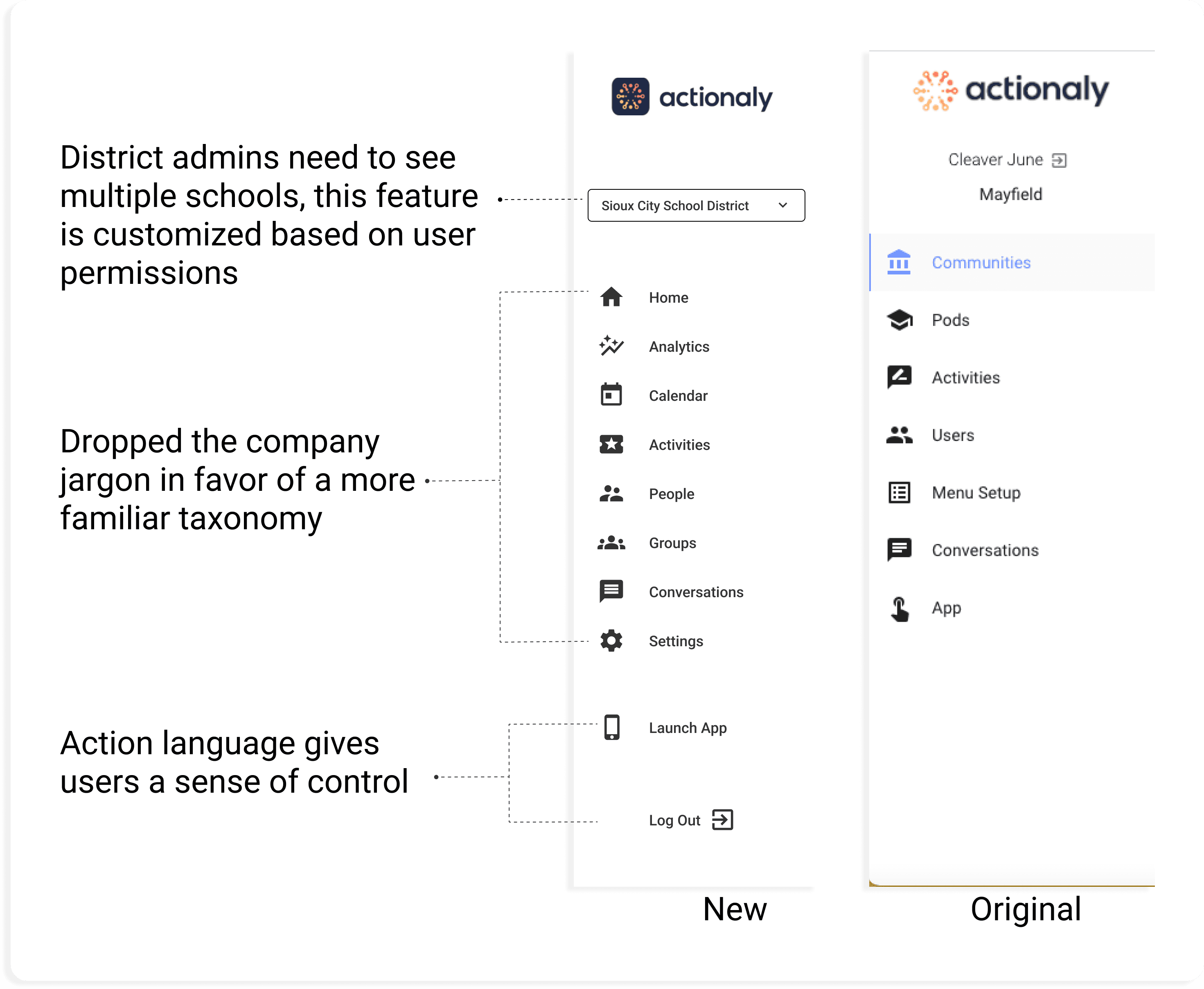
To make features easy to find and maintain, I introduced structure by standardizing the navigation.
Previously, pages were labeled with company jargon and direct translations from French to make the app stand out and add personality. However, learnings from interviews led us to a more familiar taxonomy. I added a separate Settings page that allows the Actionaly team or a power user at the school to customize the app based on user group; school admin or district admin.
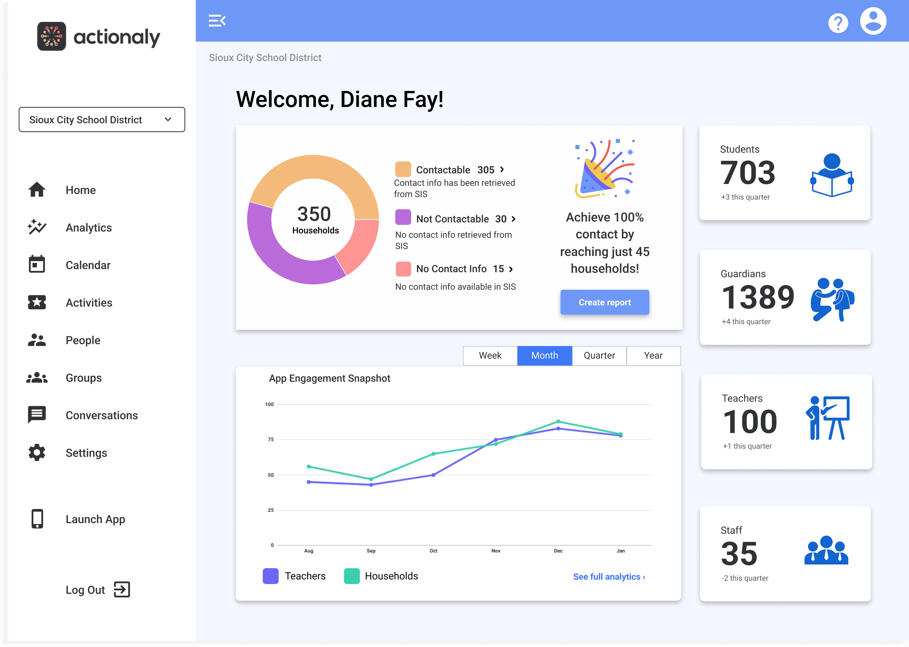
Home screen
The web app was developed as an internal tool for the Actionaly engineering team to manage the native mobile app. They made it available to school administrators at the peak of COVID, when communication with families with crucial. Once students returned to the classroom, they decided to dedicate more attention to improving the user experience.
Existing
The existing home screen read like a sloppy Word doc, and most users ignored it.

New
The new Home screen acts as a dashboard that
Orients the user and allows for personalization
Provides a snapshot of useful information and emphasizes the key value prop; the ability to manage and track family engagement
Makes data actionable; schools know whose contact info is missing and can report population data for grant funding
Retrospective
One round of testing showed that the new taxonomy was a hit with current users. We had 85% validation of the featured data, and more research is being conducted to surface useful content for each user group. Since implementation, Actionaly has continue to grow in user base and headcount.